Visit
Visit 
How to Choose the Perfect Color Palette for Your Tiles
 Copy Link
 Email
Email
 Twitter
 Pinterest
 Instagram
 Facebook

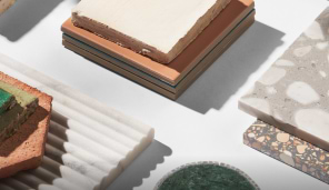
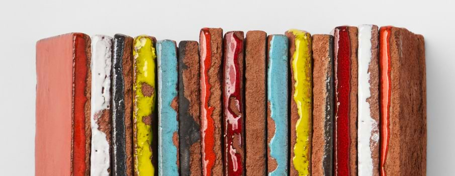
Choosing the perfect color palette for your tiles is a crucial step in the design process, as it sets the tone for the entire space. The color of your tiles can influence the ambiance, style, and overall aesthetic of a room, making it essential to select the right hues that complement your vision. With various factors such as lighting conditions, room size, design preferences, and practical considerations at play, navigating the world of bright colorful tiles can feel overwhelming. However, by understanding the importance of color in tile selection and considering the factors that influence color palette choice, you can make informed decisions that result in a beautifully cohesive and harmonious space.
Understanding Color Theory
Color theory is the study of how colors interact with each other and how they are perceived by the human eye and brain. Knowing the basics of color theory can help in choosing the right color palette for your space.
A. Basic Principles of Color Theory
Color wheel: Understanding the color wheel, which consists of primary, secondary, and tertiary colors, helps in creating harmonious color combinations.
Color schemes: Familiarity with different color schemes such as complementary, analogous, and monochromatic assists in selecting cohesive tile palettes. Purchasing tile sets with predetermined color palettes can narrow down choices and open-up possibilities.
B. Relationship between Color and Mood
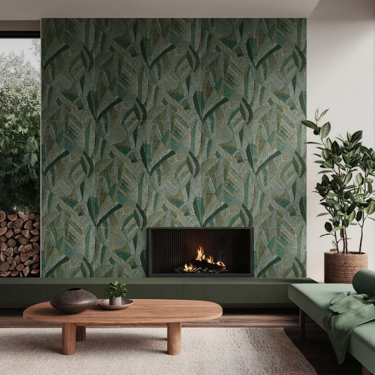
Warm colors: Colors like red, orange, and yellow evoke feelings of warmth, energy, and vibrancy, making them suitable for creating lively and inviting spaces.
Cool colors: Shades of blue, green, and purple are associated with calmness, relaxation, and tranquility, ideal for promoting a sense of serenity in a room.

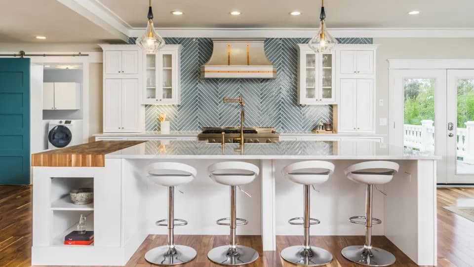
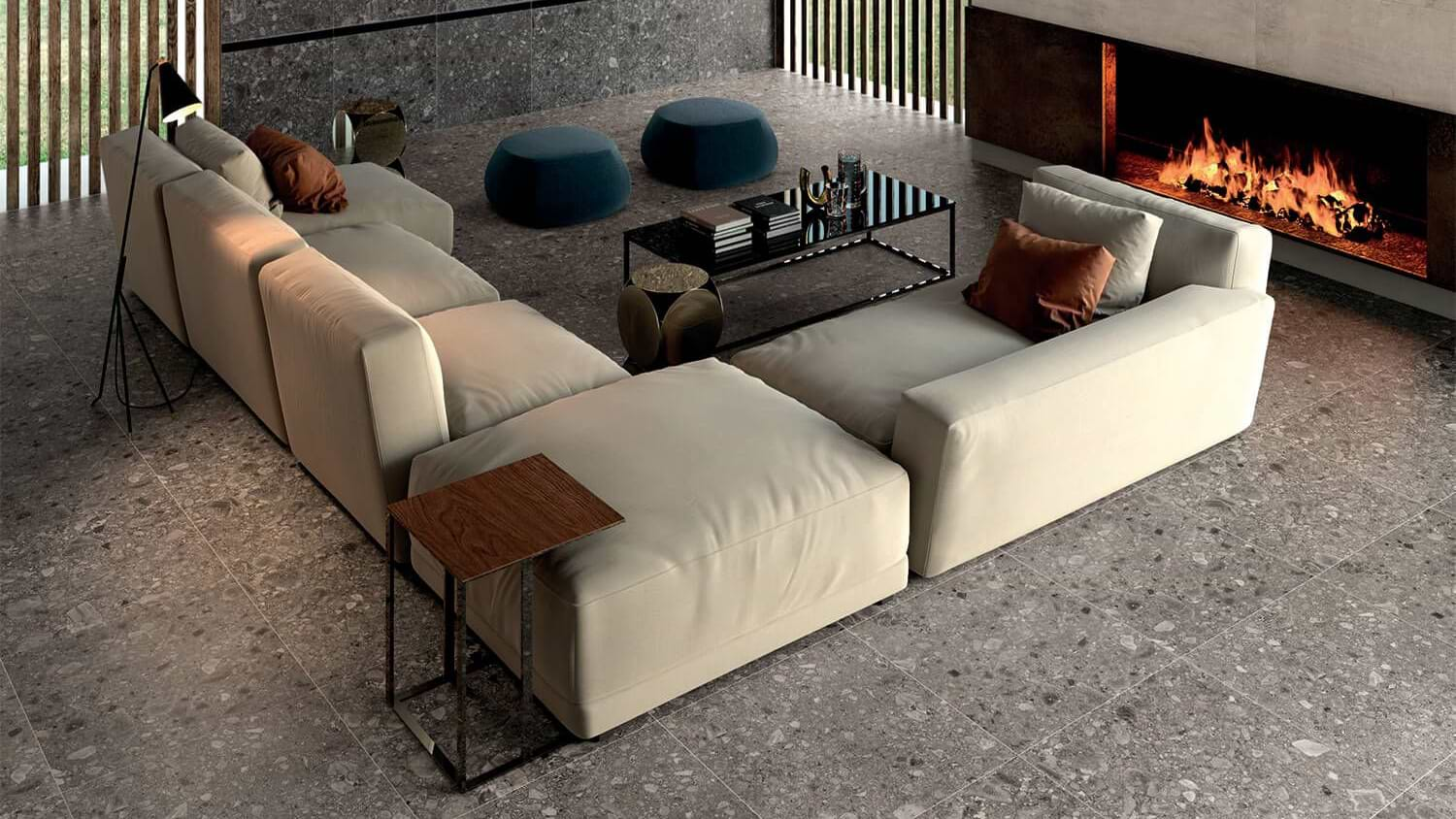
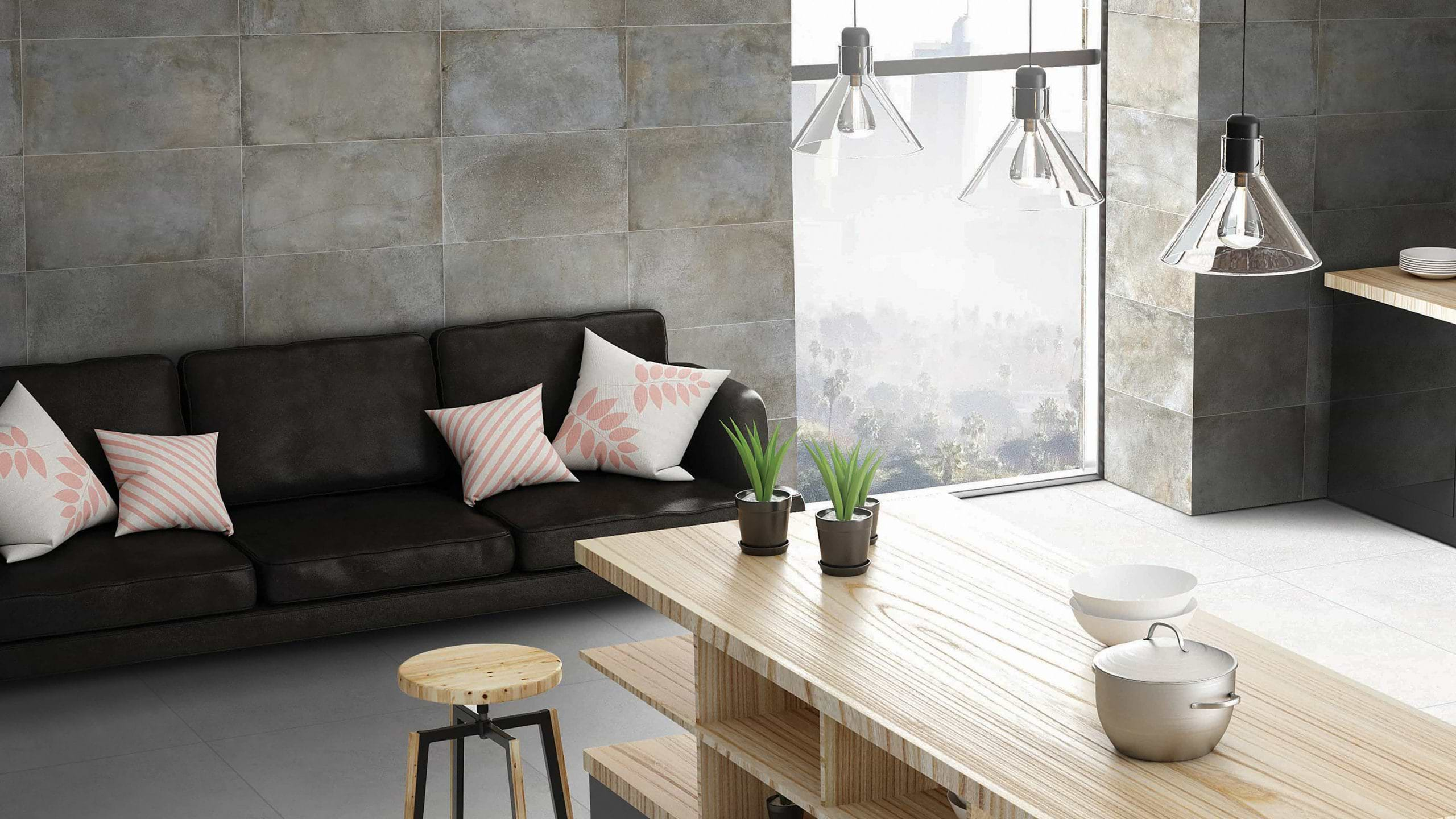
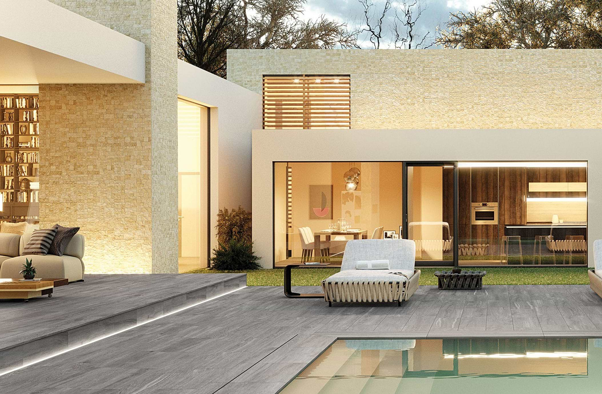
Neutral colors: Neutral tones such as beige, gray, and white offer versatility and balance, allowing for easy coordination with various design styles and moods.
C. Consideration of Color Psychology
Cultural associations: Different colors hold cultural significance and symbolism, influencing how they are perceived and interpreted in different contexts.
Personal preferences: Individual preferences and experiences with certain colors can impact how they make us feel, guiding color choices in interior design.
Functional considerations: In addition to emotional responses, practical considerations such as the intended use of the space and desired atmosphere play a role in selecting tile colors that align with the desired mood and functionality.
Assessing the Space
A. Evaluation of Natural Light Sources
- Assess the intensity and direction of natural light entering the space throughout the day.
- Consider how sunlight affects the appearance of colors, as it can enhance or diminish their vibrancy and warmth.
- Take note of areas with limited natural light and choose colors that can help brighten and open up those spaces.
B. Consideration of Room Size and Layout
- Evaluate the size, shape, and layout of the room to determine the impact of color on its perceived dimensions.
- Lighter colors such as whites, pastels, and soft neutrals create an illusion of space and airiness, making small rooms feel larger.
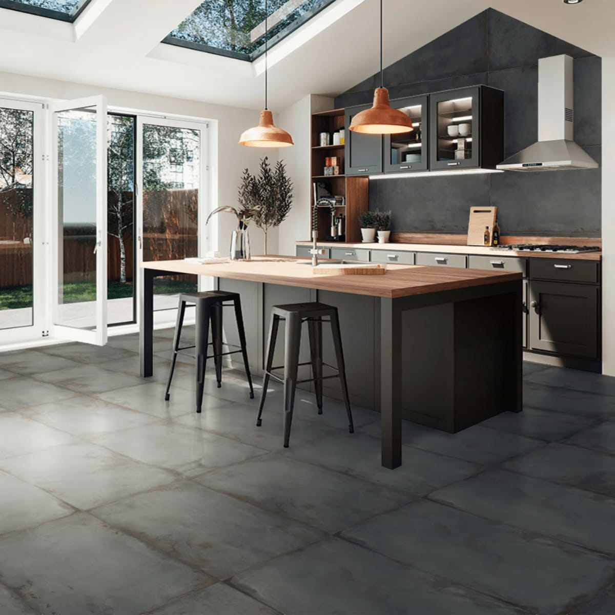
- Darker colors add depth and coziness to larger rooms, creating a more intimate and inviting atmosphere.
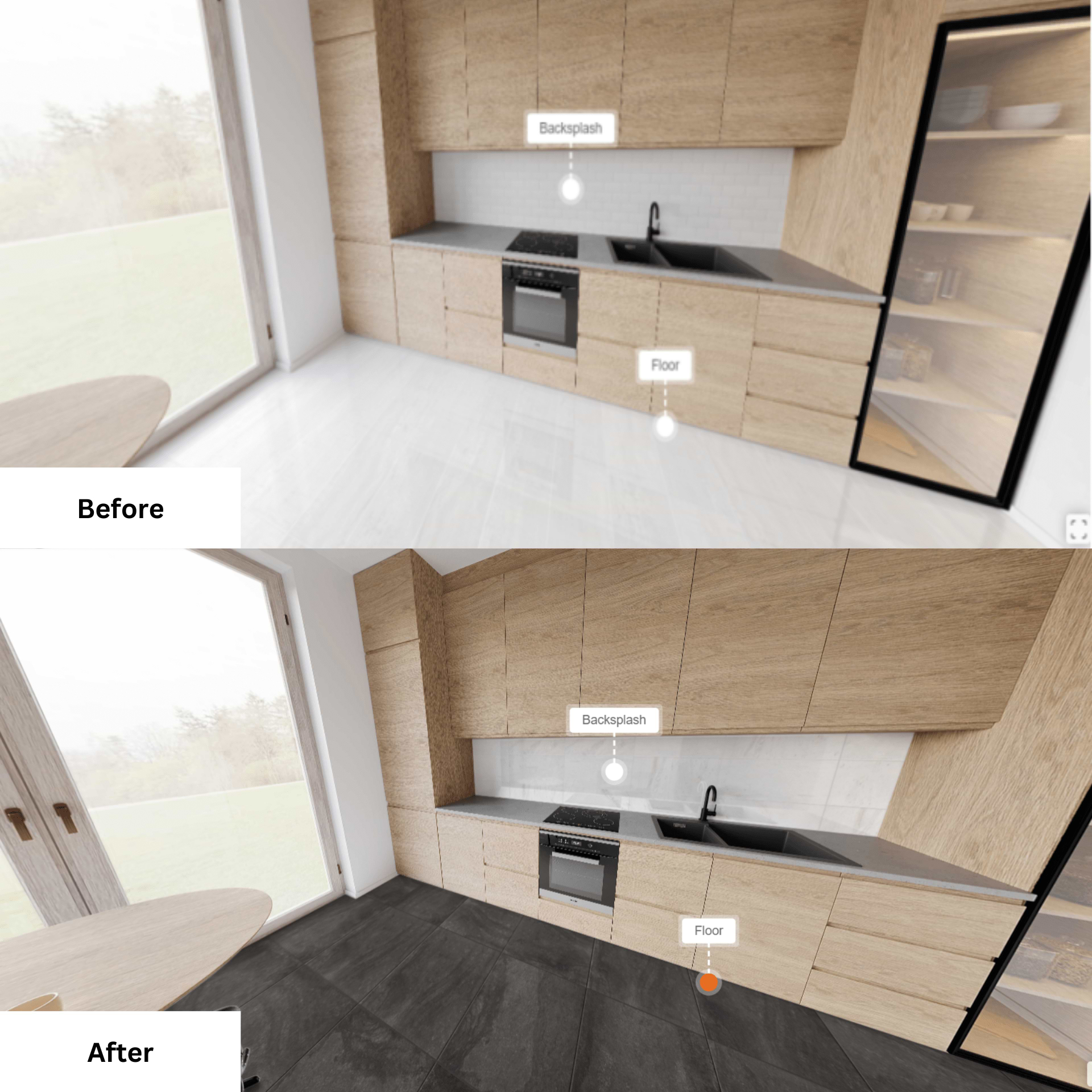
To better visualize the effects of tiles, why not try Tilebar’s 360” Visualizer. Seeing tiles with furniture can help you imagine the effect of different tile colors and designs.
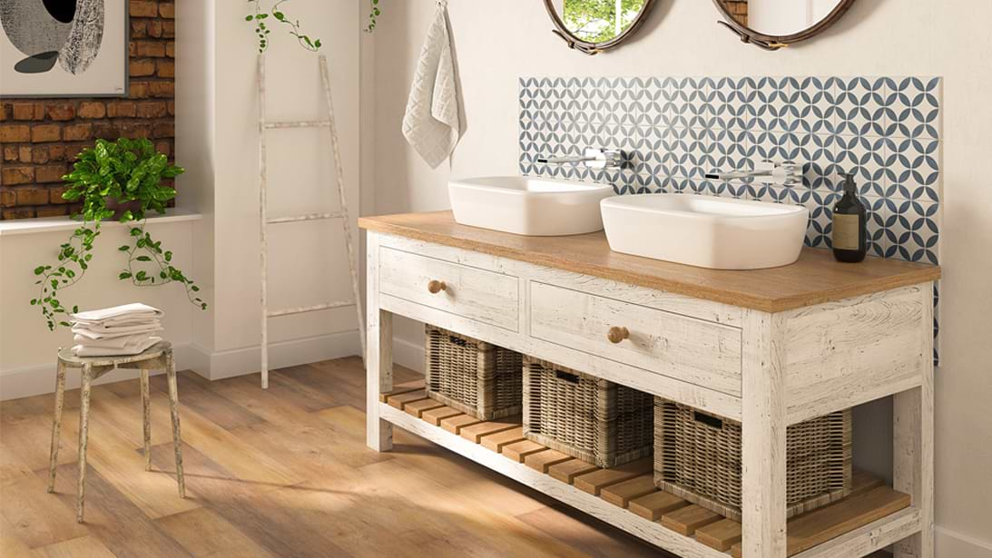
C. Existing Decor and Architectural Elements
- Take stock of the room’s existing decor, including furniture, fixtures, and accessories, to ensure that tile colors complement and enhance the overall design scheme.
- Consider the architectural elements such as trim, molding, and flooring materials, ensuring that tile colors harmonize with these elements for a cohesive look.
- Identify any dominant colors or patterns in the decor and architectural features to guide your tile color choices and maintain visual unity throughout the space.
Determining Style and Atmosphere
Before committing to a style, consider personal preferences and desired design styles, such as modern, traditional, minimalist, or eclectic.
Explore inspiration sources such as interior design magazines, websites, and social media platforms to gather ideas and identify preferred color palettes.
Aim for consistency and coherence in the overall design by selecting tile colors that complement and enhance other elements in the space. Choose colors that reflect the intended mood or atmosphere of the room, whether it’s calming and serene or vibrant and energetic.

Balancing Trends with Timeless Appeal
Stay informed about current design trends but prioritize timeless appeal when selecting tile colors to ensure longevity and relevance.
Opt for classic and versatile colors that can stand the test of time, while incorporating trendy accents or accessories for added interest.
Choosing the Right Color Palette
A. Selecting Primary Colors
Begin by choosing one or two primary colors that serve as the foundation of your color palette.
Consider the mood and atmosphere you want to create, as well as how the primary colors will interact with other elements in the space. Make sure to choose the right colors for the right space. The colors you choose for your bathroom can be different from your kitchen.
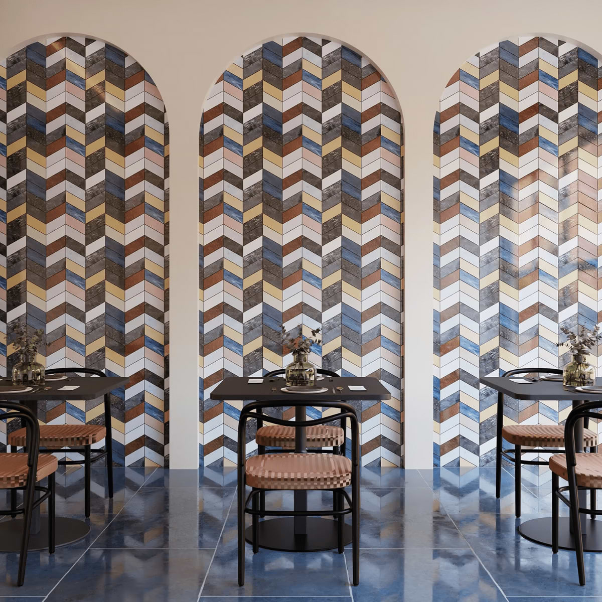
B. Exploring Complementary and Analogous Schemes

Explore complementary color schemes, which consist of colors opposite each other on the color wheel, for bold and dynamic contrasts.
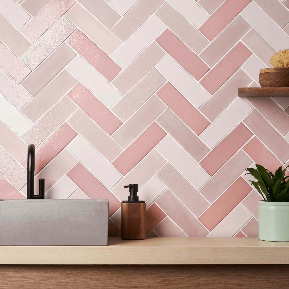
Alternatively, consider analogous color schemes, which consist of colors next to each other on the color wheel, for harmonious and cohesive combinations.
C. Incorporating Neutral Tones for Balance
Balance vibrant or bold colors with neutral tones such as white, gray, or beige to create visual harmony and balance in the space.
Neutral tones serve as versatile foundations that complement a wide range of colors and design styles, allowing for flexibility and adaptability in the overall color palette.
Sampling and Testing
Obtain samples of your chosen tile colors and patterns to see how they look in the actual space.
Place the samples in different areas of the room to evaluate how they interact with the existing decor, lighting, and architectural features.
Take into account the finish and texture of the tiles, as these can affect how colors are perceived in the space.
Matte finishes tend to absorb more light and appear softer, while glossy finishes reflect light and create a more vibrant look.

Textured tiles add depth and visual interest to the space, enhancing the overall aesthetic and ambiance.

Practical Considerations
A. Maintenance Requirements
Evaluate the maintenance needs of different tile colors, considering factors such as stain resistance, ease of cleaning, and susceptibility to wear and tear.
Choose tile colors that align with your lifestyle and willingness to commit to regular maintenance routines.
B. Durability and Longevity of Colors
Consider the durability and colorfastness of tile colors, especially in high-traffic areas or areas exposed to sunlight.
Opt for colors that are resistant to fading, discoloration, and damage from environmental factors to ensure long-lasting beauty and performance.
C. Budget Constraints
Determine your budget for tile installation, including material costs, labor costs, and any additional expenses such as underlayment or grout.

Explore cost-effective options without compromising on quality or aesthetic appeal, balancing affordability with durability and style.
Finalizing the Decision
Review samples of different tile colors and compare them side by side to visualize how they will look in the space.
Consider how each color palette complements the overall design scheme and meets practical considerations such as maintenance and budget.
Consult with interior designers, tile specialists, or trusted peers to gather feedback and insights on your color palette choices.
Consider their expertise and perspective to make informed decisions that align with your design goals and preferences.
Trust your instincts and choose colors that resonate with you while ensuring they meet the practical requirements of the space.
Conclusion
By understanding the importance of color theory, assessing the space, and considering practical factors such as maintenance requirements and budget constraints, you can make informed decisions that result in a cohesive and visually appealing tile color palette. Remember to trust your instincts, seek input from design professionals or peers when needed, and most importantly, enjoy the creative process of transforming your space into a reflection of your unique style and personality. With the right color palette, you can create a home that not only looks beautiful but also feels inviting and harmonious—a space where you can truly feel at home.
Frequently Asked Questions (FAQs)
What is the significance of color in tile selection?
Color plays a crucial role in tile selection as it influences the overall aesthetic, mood, and ambiance of a space. The right color palette can enhance the visual appeal and create a cohesive and harmonious look.
How do I determine which tile colors will suit my space?
Consider factors such as the size and layout of the room, natural light sources, existing decor, and personal preferences when choosing tile colors. Sampling and testingtiles in the space can also help visualize how different colors will look.
What are some popular color schemes for tiles?
Popular color schemes include complementary, analogous, and monochromatic schemes. Complementary colors are opposite each other on the color wheel and create contrast, while analogous colors are adjacent to each other and create harmony.
Related Articles
Explore Our
Tilefinder